
Simply put… The shadows and layers spoke for the content
Type Design
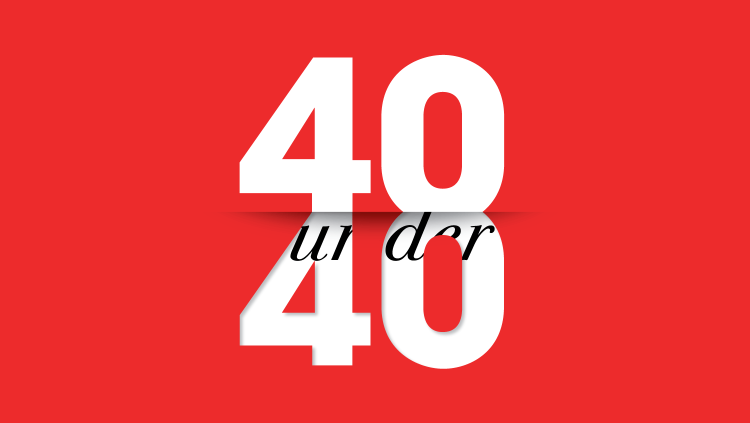
40 under 40
40 under 40 featured 40 high achievers in the industry under 40 years old. The cover story marked the start of the premium online subscribers. I was responsible for creating a typeface illustration to represent this special occasion and for leading the webpage. Simple and direct, the form—layering the type—conveyed the message effectively. The result was a recognisable and elegant anchor image that spoke for itself.
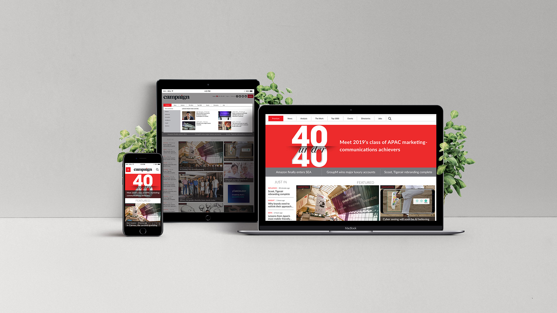
Brand new… The type design marked the start of the premium subscription